Typography Workshop
Typography is an important part of a successful book cover design. When combined with an image, text tells the reader the title and who wrote the book. It could also be typed in a particular style or colour to reflect the nature of the book, such as key themes or a particular emotion conveyed by the story.
Typography is defined as 'the art and technique of arranging type to make written language legible, readable and appealing when displayed'.
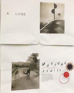
We were given an introduction to Typography and then set workshop tasks to put into practice what we had learnt. We started by creating three double page spreads, exploring the relationship between text and image. We were given a selection of images to choose from as well as various typeface styles and symbols. We created our cut and paste collages on A2 paper, it was interesting to work on a larger scale than I usually do. I had to think more carefully about the composition and amount of negative space I left surrounding the text and image.
I used my chosen images to create magazine style spreads, deciding on text that could be associated with the image. I kept the colour palette of each double page spread fairly limited because I wanted the emphasis to be on how the image was presented and how it was combined with the text to create a full image.
I am quite pleased with how these text and images collages turned out. They look quite professional considering that I haven't done alot of this sort of work before. I think I could still make the typography stronger, experimenting with how it is displayed as well as the colour, style and shape.
 |
| 'A Lone, Musical trails' |
 |
| 'The Peaceful Read' |
 |
| 'Longing' by Cody Wax |
 |
| 'Past Time' by Grace Fun |
 |
| 'Boo' by Amy Seb |
When analysing these book cover design ideas, I think the third design is the most successful because it is simplistic and the typography stands out. I think symbols can work well on a book cover to an alternative to a more detailed image because it suggests that there is more to the book than meets the eye. There isn't alot of visual information being given to the reader so this encourages them to pick up the book and read it to find out what it is really about. Once they have read the book, they may find that the front cover makes more sense to them then. A sense of intrigue is a good way to catch the readers attention in the first instance when they are browsing for books. I also think a simplistic book cover like this could work better on a digital platform such as an e-book reader because it would still be of good quality on a digital screen. Some book covers work better for a paper book but I believe a cover like this could work for both a paper and a digital book. The negative space creates a sense of energy between the two separated visual elements of the book cover design.
 |
| The three book cover designs I created in the Typography workshop displayed along with my possible book cover designs for 'Noughts and Crosses' |
Above is a photo of all the work I created of book cover designs, including a text and image collage of the actual book I am creating a cover design for, 'Noughts and Crosses' by Malorie Blackman. I like the simplicity of the image but I feel that the text is too dominating and large in this cover design so I won't be developing it further. I have also included the three front cover designs I have created so far for 'Noughts and Crosses' using drawing mediums. Find out more about these designs in my next blog post.
I intend to experiment further with using cut and paste as a technique that suits book cover designs, basing my designs on the book I am making the cover for. I would like to keep the colour palette quite limited I think, to make the design simplistic but effective in conveying themes found within the book to a potential reader.


Comments
Post a Comment